
A New License Plate for Rhode Island – Architecture Critic Morgan
Will Morgan, Architecture Critic
A New License Plate for Rhode Island – Architecture Critic Morgan
For a Rhode Islander, picking a design for a new license plate is as important as naming a child. The current “Wave” plate has been in use for twenty-five years, so selecting a new state identifier is important. It is, in the words of Department of Motor Vehicles Director “Bud” Craddock, “a generational opportunity,” as the license plate is “a symbol that transports a piece of Rhode Island to the rest of the county.”
GET THE LATEST BREAKING NEWS HERE -- SIGN UP FOR GOLOCAL FREE DAILY EBLAST

With that heavy responsibility, the DMW has opened the design of the new plate to everyone. But the Wave has set the bar very high. When the distinctive gray and white design by Tyler Smith was released in 1996, professional graphic designers hailed it the best modern license plate. The RISD-trained Smith approached the plate in its entirety, and deliberately kept the palette simple. That simplicity helped extend its long life. Imagine how a tacky pictogram and a slogan, such as former governor Gina Raimondo’s preferred motto of Cooler and Warmer, would have held up for that span of time.

This column is a supporter of design competitions, believing they can unlock unknown sources of talent. Back in 1926, for example, the Territory of Alaska held an open contest for its flag; the winner was a thirteen-year-old Aleut from a mission school. A century later, the Alaskan banner is still one of strongest and most recognizable state flags, its Big Dipper and North Star configuration is both simple and symbolic.

There are some dangers in a wide-open selection process. How many quahogs and lighthouses, beaches and seagulls, bridges and sailboats can a six-by-twelve-inch rectangle hold. And the judges are not noted graphic designers or RISD professors–the four finalists that everyone can then vote on will be chosen by DMV staff. No doubt there will be proposed designs that are as silly and as embarrassing as the Rhode Island Save Wildlife tag.

One also needs to beware of mottos, which can prove as embarrassing as a tattoo obtained when one was eighteen and inebriated. The DMV should drop the requirement that submissions include the slogan Ocean State. Rising seas might render that moniker more than ironic in places like Newport and Narragansett in twenty years, while its it would seem to preclude non-nautical images such as Slater Mill or the Johnston Landfill. Ocean State, along with mottos such as the Treasure State, the Natural State, and the Silver State, not to mention Famous Potatoes and Chile Capital of the World, are just tourism hyperbole that clutter the plate and cheapen the state’s image. Cooler and Warmer, indeed.
Initially, an object of pride (and perhaps a political statement), this pre-Black Lives Matter plate, photographed in Washington, might be a liability in certain neighborhoods.

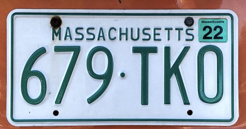
The other stricture imposed by the DMV (or rather by the manufacturer, 3M) is that the new license plate will be digitally printed. Embossed numerals and letters will be replaced with a flat surface that allows all sort of pictures. Easier to scan, but not necessarily safer, digital plates have spawned an entire range of graphic picture-plates. The America’s Cup sailboat on the Chafee Administration’s proposed replacement was rather restrained compared to the Disney-like little screens coming out of places like Ohio. Never mind that a primary function of a license plate is supposedly legibility.

The digital screening makes all kinds of details available. We can look forward to lots of ideas for the new Rhode Island tag: regattas, farm scenes, various sports teams, faces of local legends–Roger Williams, Raymond Patriarca, a Bristol slave trader. What these cute tableaus do not do is provide simple, strong designs.

It may be grinch-like to disparage the fun of the free-for-all design contest for a new Rhode Island tag. But we would be better off if we secure a pictograph-less, motto-less plate: no anchors, no waves, no raccoons.
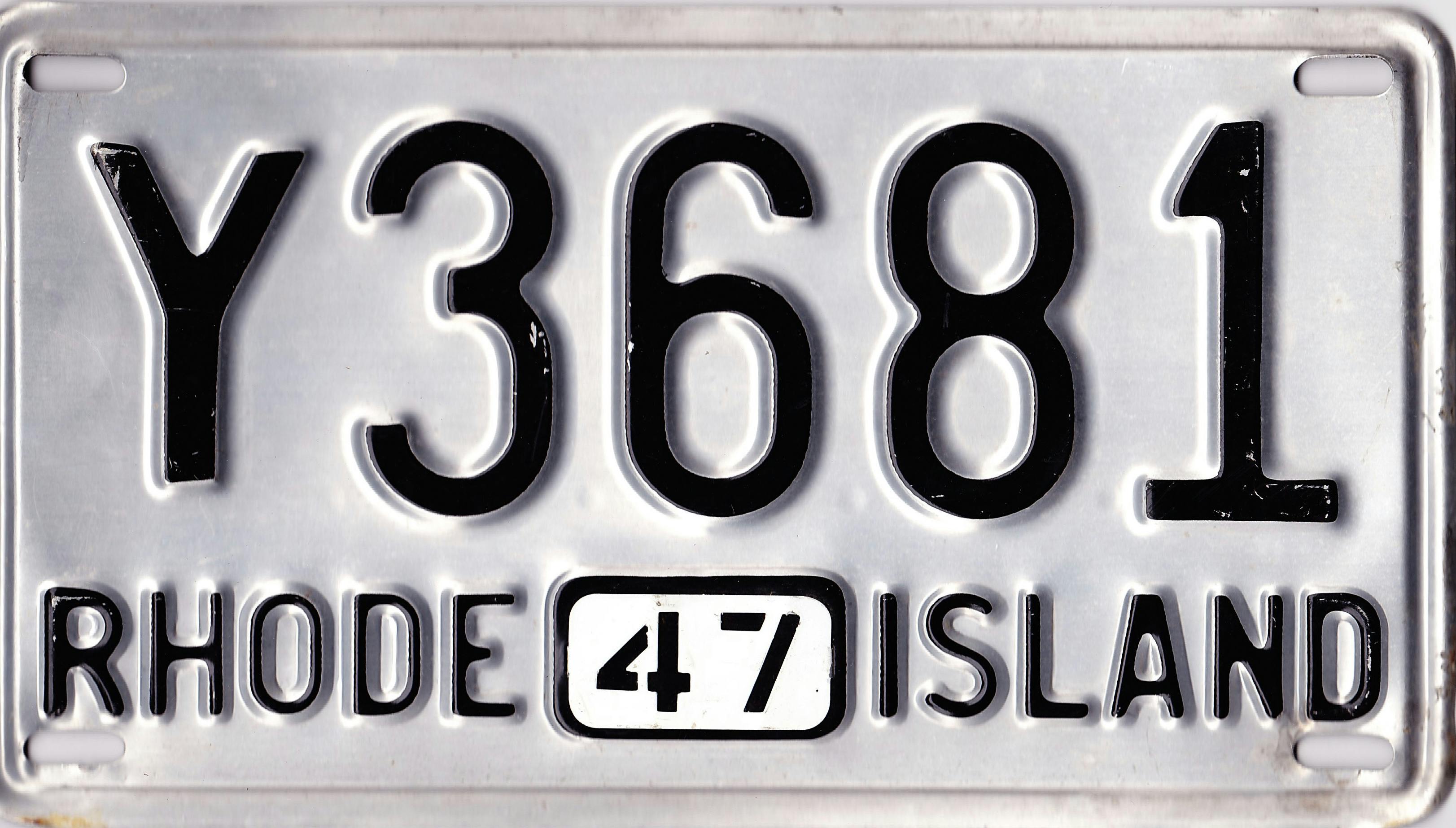
Then there is the Rhode Island classic.